Software
User Interfaces
Contents
A user interface is the part of the operating system that lets a person communicate with the computer. Without one you could not give the computer instructions, and you could not see what it had done.
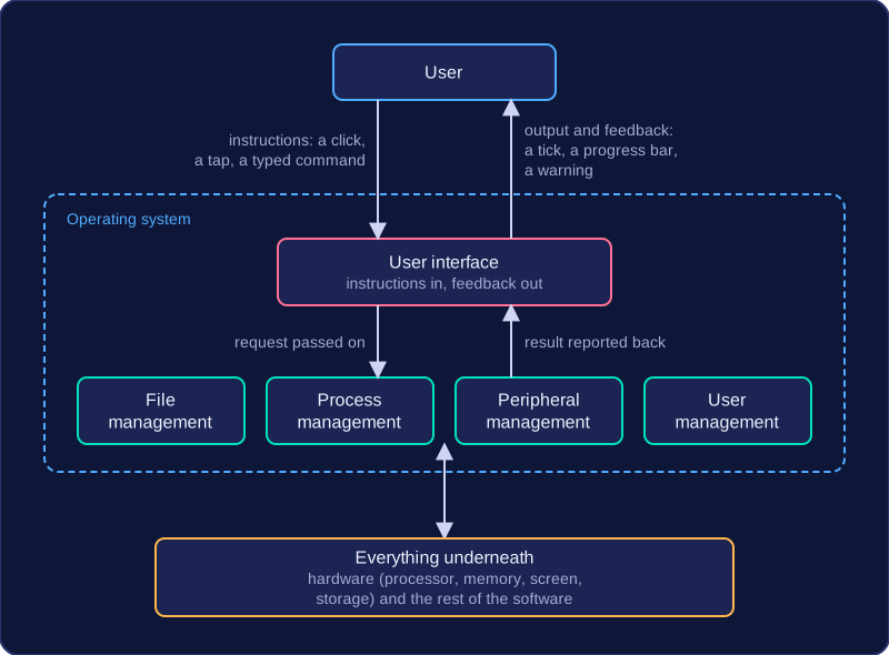
It works in both directions. It takes in your instructions — a click, a tap on a screen, a typed command — and passes them on to the operating system. It also presents output and feedback, such as a tick appearing next to a file you have just saved, a progress bar while a video uploads, or a warning that your password was wrong.
Where it sits
The user interface is a layer between you and everything underneath it: the hardware (processor, memory, screen, storage) and the software (the rest of the operating system and your programs). Because it handles that contact for you, you never deal with the hardware directly. You do not need to know which part of the disk holds your saved work, or the exact instructions the processor needs to fetch it — you simply pick the file and open it.
| What you do | What the interface deals with |
|---|---|
| Press Save on a document | Passes the request to file management so the file is written to storage |
| Enter a username and password | Passes the details to user management, then shows you the result |
| Send a job to the printer | Passes the job to peripheral management and reports back on progress |
One function, not the whole system
The user interface is only one function of the operating system, not the operating system itself. The same software also manages files (storing, naming and finding them), processes (deciding which program uses the processor next), peripherals (printers, keyboards and sensors) and users (accounts and permissions). A helpful way to picture it is a café counter: it is the part you talk to, but plenty of work is going on behind it.
Not every user interface is graphical: some systems use a command line or a set of menus instead, which changes how you give your instructions.
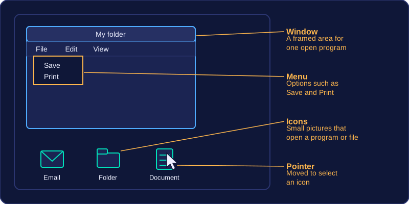
A graphical user interface (GUI) lets you control a computer by choosing pictures and options on screen instead of typing instructions. Its visual elements are usually summed up as WIMP.
| Element | What it is |
|---|---|
| Windows | Separate framed areas, each showing one open program or folder |
| Icons | Small pictures that open a program or file when selected |
| Menus | Lists of options you pick from, such as Save or Print |
| Pointer | The pointer (usually an arrow) on screen that you move to select things |
You work a GUI mainly with a pointing device, such as a mouse or trackpad, or by touching the screen. Actions are done by pointing at something and selecting it, so very little is typed.
Advantages
A GUI is easy to learn and use, especially for beginners. You recognise an icon or a menu option rather than remembering the exact instruction behind it. A pupil opening their school email for the first time can spot the envelope picture and select it, even though they know no commands at all.
Disadvantages
- A GUI needs more memory and processing power, and takes up more storage space, than a text-based interface. Every window, icon and menu has to be held in memory and drawn on screen, so the computer works harder just to display the interface, and the software that draws them takes up more storage space. Being easier to use does not make it lighter on resources.
- A GUI is slower for an experienced user doing repetitive or complex work, because a task that takes one command in a text-based interface may take several clicks. Renaming thirty files one by one, for example, means thirty rounds of pointing and clicking, where a single command could deal with them all at once.
A command line interface (CLI) is a user interface where you type instructions in a fixed syntax, and the results appear as text on the screen. There are no icons, menus or mouse pointer to use — you type a command, press Enter and read the reply.
The commands you type are instructions to the operating system, which carries them out. This is not the same as writing a program: the commands already exist as part of the operating system, and you are choosing which one to run and what it should work on. A program, by contrast, is your own set of instructions, saved and run as a whole.
Advantages of a command line interface
- Uses fewer system resources — very little is drawn on screen and there are no graphical elements to track, so a CLI needs less memory and processing power than a graphical interface. That suits a device with limited memory and processing power.
- Quick for an experienced user — one typed line can do a job that would take several clicks through menus.
- Precise control — extra details can be added to a command to say exactly what should happen, such as which folder a file is copied into.
- Commands can be stored and repeated — a list of commands can be saved and run automatically, so the same steps happen every time. A weekly backup of a club's shared folder can be set up this way instead of someone clicking through it each week.
Disadvantages of a command line interface
- You must learn and remember the exact commands and their syntax — correct spelling, the right order and the right spaces. Without a reference list, a beginner will struggle, so a CLI is harder to use than a graphical interface.
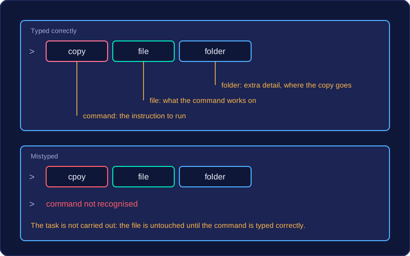
- A mistyped command produces an error message and the task is not carried out. Typing
cpoyinstead ofcopyto duplicate a file just returns an error such as "command not recognised", and the file stays untouched until the command is typed correctly.
A menu-based interface gives you a short list of options to choose from instead of typing an instruction. The choices are often split across several screens, so choosing an option on one menu opens the next menu down.
How it works
Each screen shows a few options, each with a highlight or a number. You move the highlight with a button and confirm, or press the matching number key. Choosing an option either carries out an action or opens a menu one level deeper.
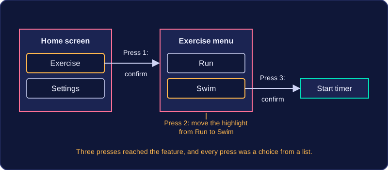
For example, a fitness tracker with a small screen and two buttons might open with Exercise and Settings. With Exercise highlighted, confirm opens a second menu: Run and Swim. Move to Swim and confirm to start the timer. Three presses reached the feature, and every press was a choice from a list.
You find this style on devices with a small screen or few buttons, such as set-top boxes, cash machines, older mobile phones and the settings screen of a camera.
Advantages
- Nothing to remember — the options are on screen, so a first-time user can work the device out without learning commands.
- Only valid choices — the designer decides what appears, so you can only pick options the device is designed to handle, which reduces mistakes.
- Works with a few buttons — no keyboard or mouse is needed, which keeps a small device cheap and simple to build.
Disadvantages
- Slow to reach an option — a feature three levels down takes several presses, which becomes tedious for someone who uses it many times a day.
- Only the designer's choices — if the job you want is not listed, you cannot do it at all.
- Poor for complex tasks — anything open-ended, such as writing a report or editing a photo, would need too many combinations of choices, so a graphical interface suits it better.
A menu-based interface is not the same as a GUI. A GUI uses windows, icons and a pointer; here the whole interaction is picking from lists.
Not every device is used with a keyboard and mouse. Other interface styles change how you give instructions to a computer, so you can interact by touching, moving or speaking.
Touch control
Touch control uses taps, swipes and pinches on a touchscreen. You choose an option by touching it directly, so there is no separate pointing device. It is common on phones and tablets, and on information kiosks such as a touchscreen in a museum that lets you find out about an exhibit. The screen still shows options to choose, but your finger replaces the mouse.
Gesture and voice control
Gesture control recognises hand or body movements, usually with a camera or motion sensor. Some games consoles use it so you can play by swinging your arm, and some smart TVs use it so you can raise a hand to pause a programme without searching for the remote.
Voice control recognises spoken commands. It is useful when your hands are busy, such as asking a smart speaker to set a timer while you are cooking, and it can help someone with limited hand movement to use a device on their own.
Why these styles are used
These interfaces suit devices where a keyboard and mouse are impractical: a phone is too small, a television is across the room, and a console is often played standing up. For example, a garden centre puts a touchscreen by its plant display so customers can tap a picture to check watering advice. A keyboard would take up space and be awkward for customers standing at the display, while tapping a picture is quick and clear.
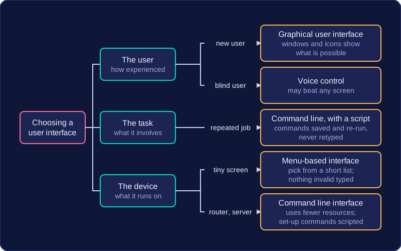
There is no single best interface. The right one depends on three things: how experienced the user is, what the task involves, and the device the interface has to run on. When you choose one, link it to the user, the task or the device and say why, rather than describing every type you know.
Justifying a choice
Take a school office assistant who totals the dinner money every Friday: open a file, run the same few instructions, save the report. A command line interface suits this because the commands can be saved as a script and re-run, so the job takes seconds and the assistant never retypes them. Give the same job to a new volunteer on their first day and a graphical user interface is better, because the windows and icons show what is possible without learning any commands.
Small devices push the choice another way. A handheld ticket scanner at a leisure centre has a tiny screen and four buttons, so a menu-based interface fits: the user picks from a short list of options and cannot type anything invalid. A full windowed interface would waste memory and processing power on a device that does not need it.
Not every device needs a GUI
A graphical interface uses windows, icons, menus and a pointer, so it needs more memory, processing power and storage than a text-based one. Some systems skip it on purpose: a home broadband router or a server in a rack is set up with typed commands, because a command line uses fewer resources and the set-up commands can be scripted and repeated. Likewise, a newer or easier-looking interface is not automatically better: for a blind user, voice control may beat any screen; for a technician repeating one job, typing beats clicking. Match the interface to the situation, then say why.