User Interfaces
Choosing a User Interface
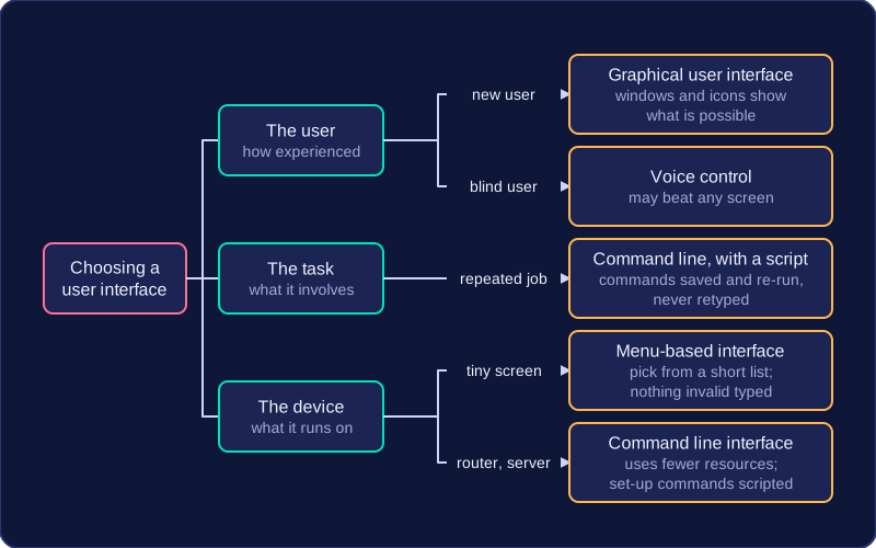
There is no single best interface. The right one depends on three things: how experienced the user is, what the task involves, and the device the interface has to run on. When you choose one, link it to the user, the task or the device and say why, rather than describing every type you know.
Justifying a choice
Take a school office assistant who totals the dinner money every Friday: open a file, run the same few instructions, save the report. A command line interface suits this because the commands can be saved as a script and re-run, so the job takes seconds and the assistant never retypes them. Give the same job to a new volunteer on their first day and a graphical user interface is better, because the windows and icons show what is possible without learning any commands.
Small devices push the choice another way. A handheld ticket scanner at a leisure centre has a tiny screen and four buttons, so a menu-based interface fits: the user picks from a short list of options and cannot type anything invalid. A full windowed interface would waste memory and processing power on a device that does not need it.
Not every device needs a GUI
A graphical interface uses windows, icons, menus and a pointer, so it needs more memory, processing power and storage than a text-based one. Some systems skip it on purpose: a home broadband router or a server in a rack is set up with typed commands, because a command line uses fewer resources and the set-up commands can be scripted and repeated. Likewise, a newer or easier-looking interface is not automatically better: for a blind user, voice control may beat any screen; for a technician repeating one job, typing beats clicking. Match the interface to the situation, then say why.