User Interfaces
Easy to Navigate and Learn
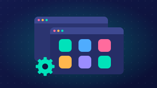
A good user interface should be easy to navigate and easy to learn. Easy to navigate means you can move around the interface and find the area or option you need. Easy to learn means a new user can work out what to do by looking, without training or memorising commands.
Making actions visible
Available actions should be visible or discoverable. If an action can only be used by remembering a hidden command or a secret key combination, many users will never find it. Showing the choices on screen lets users explore and work out what the interface can do. For example, a school clubs booking screen could show a clearly labelled Book a place option on each club, so a pupil can see how to sign up without being told.
Clear labels and grouping
Clear labels use plain words that say what an option does. A label such as Book a place is easier to understand than an abbreviation such as BP. Logical grouping puts related controls together. On the clubs screen, clubs could be grouped under the day they run, and booking options kept with each club. Users can then scan the relevant group instead of searching the whole screen, which helps them find what they need faster.
Why it helps
When actions are visible and well labelled, users learn the interface faster and feel less frustrated. They make fewer mistakes because they choose the option that matches what they want, rather than guessing. This matters most for people who are new to computers, but it helps everyone: users waste less time hunting for controls, so starting a task feels simpler.
Practise this
OCR GCSE Computer Science · User Interfaces